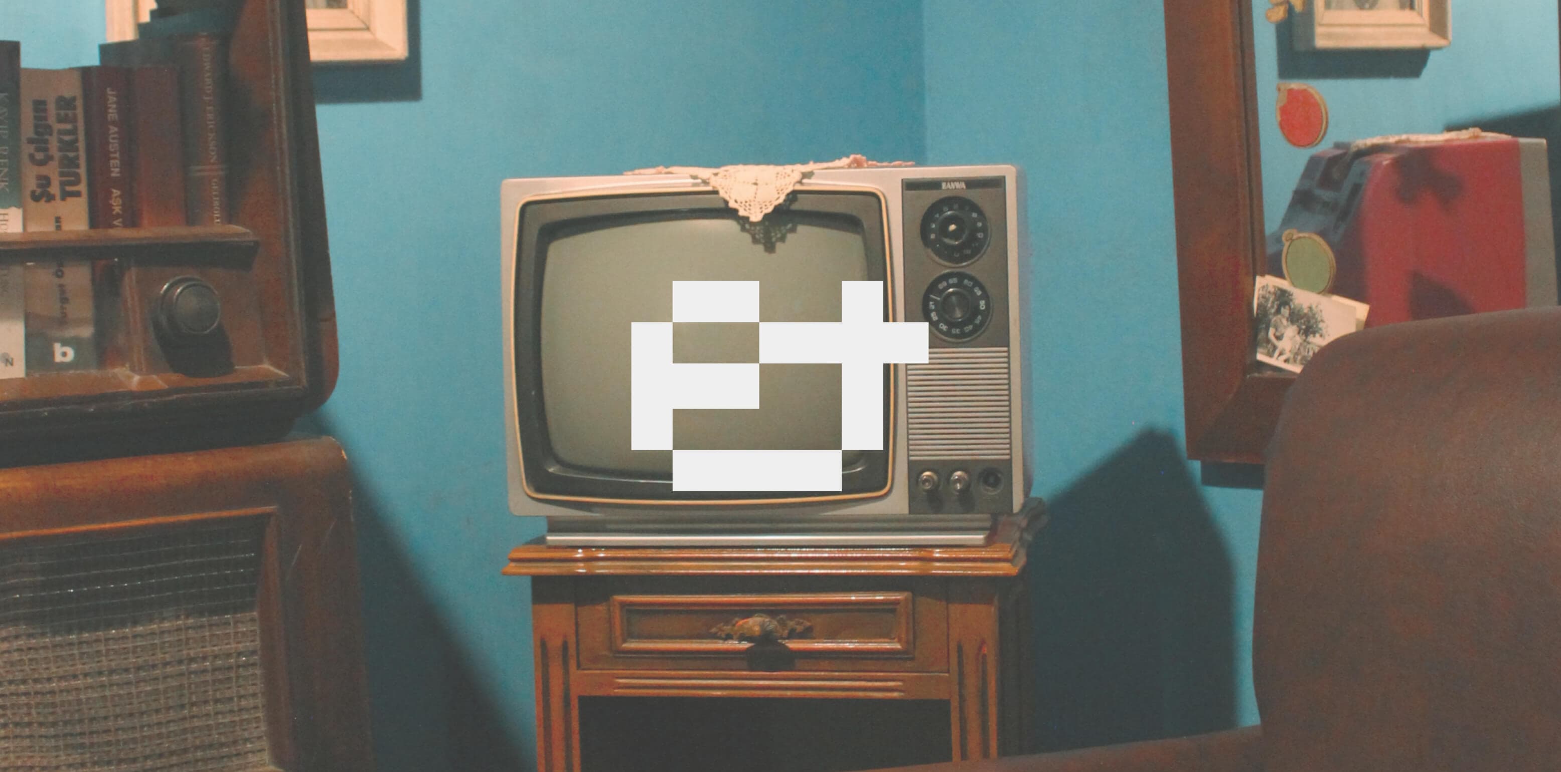
This pixel-perfect font is a nostalgic and unnecessary tribute to the golden era of point-and-click games and the early glorious days of the internet. Pst.. click on the tv to know more about this font.
Lorem ipsum dolor sit amet, consectetur adipiscing elit. Phasellus sed ligula sollicitudin, egestas eros vitae, facilisis sapien. Nam finibus lobortis dui a elementum. Suspendisse mi eros, blandit vitae tortor et, porttitor finibus nisi. Etiam sollicitudin ipsum quis tempor elementum. Suspendisse potenti. Nulla finibus felis efficitur ultricies iaculis. Maecenas pulvinar aliquam massa. Ut egestas tincidunt sapien, eu suscipit justo laoreet et. Fusce luctus eleifend molestie. Proin eget urna sit amet justo pulvinar vehicula eget sed augue. Vivamus vel congue augue, sit amet euismod elit.
Sed elementum leo non metus posuere efficitur ac at tortor. Suspendisse neque dui, elementum sit amet consectetur sit amet, vehicula nec ligula. Donec dignissim, arcu vel dapibus facilisis, arcu urna mollis est, ac feugiat lacus purus sit amet orci. Pellentesque consequat at urna at egestas. Curabitur tincidunt in leo vel commodo. Pellentesque habitant morbi tristique senectus et netus et malesuada fames ac turpis egestas. Donec rutrum malesuada lacus, quis tincidunt ipsum efficitur eget. Vivamus finibus quam felis, ut lobortis dui interdum eu. Phasellus ut dui erat. Vivamus elementum turpis velit, sed molestie augue cursus et.
Either information produces meaning (a negentropic factor), but cannot make.


In a culture like ours, long accustomed to splitting and dividing all things as a means of control, it is sometimes a bit of a shock to be reminded that, in operational and practical fact, the medium is the message. This is merely to say that the personal and social consequences of any medium-- that is, of any extension of ourselves -- result from the new scale that is introduced into our affairs by each extension of ourselves, or by any new technology. Thus, with automation, for example, the new patterns of human association tend to eliminate jobs, it is true. That is the negative result. Positively, automation creates roles for people, which is to say depth of involvement in their work and human association that our preceding mechanical technology had destroyed. Many people would be disposed to say that it was not the machine, but what one did with the machine, that was its meaning or message. In terms of the ways essence of machine technology. The essence of automation technology is the opposite. It is integral and decentralist in depth, just as the machine was fragmentary, centralist, and superficial in its patterning of human relationships is.
“Americans are in a way crazy. We infantilize ourselves. We don’t think of ourselves as citizens—parts of something larger to which we have profound responsibilities. We think of ourselves as citizens when it comes to our rights and privileges, but not our responsibilities. We abdicate our civic responsibilities to the government and expect the government, in effect, to legislate morality.

A
uppercase
ABCDEFGHIJKLMNOPQRSTUVWXYZ
lowercase
abcdefghijklmnopqrstuvwxyz
uppercase accents & diacritics
ÁÂÄÀÃÇÉÊËÈÍÎÏÌÑÓÔÖÒÕÚÛÜÙẂŴẄẀÝŶŸỲ
lowercase accents & diacritics
áâäàãçéêëèíîïìñóôöòõúûüùẃŵẅẁýŷÿỳ
numerals
0123456789
punctuation & symbols
.,:;!¡?¿·•*#//\-–—_(){}[]‚„“”‘’"'@&
currency & math
$+−×÷=><%
DesignerJuan Lautaro Martin
Publisherbasement.studio
Release dateMay 2022
Last version2.0 (
January 2023
)
Formatsotf, woff, woff2, ttf
Glyphs170
DescriptionThis pixel-perfect font is a nostalgic and unnecessary tribute to the golden era of point-and-click games and the early days of the internet. Following a strict grid, this font consists of capital letterforms in its upper and lowercase, where the former is bold and heavy while the latter is lighter and narrower.
SpecimenDownload Specimen