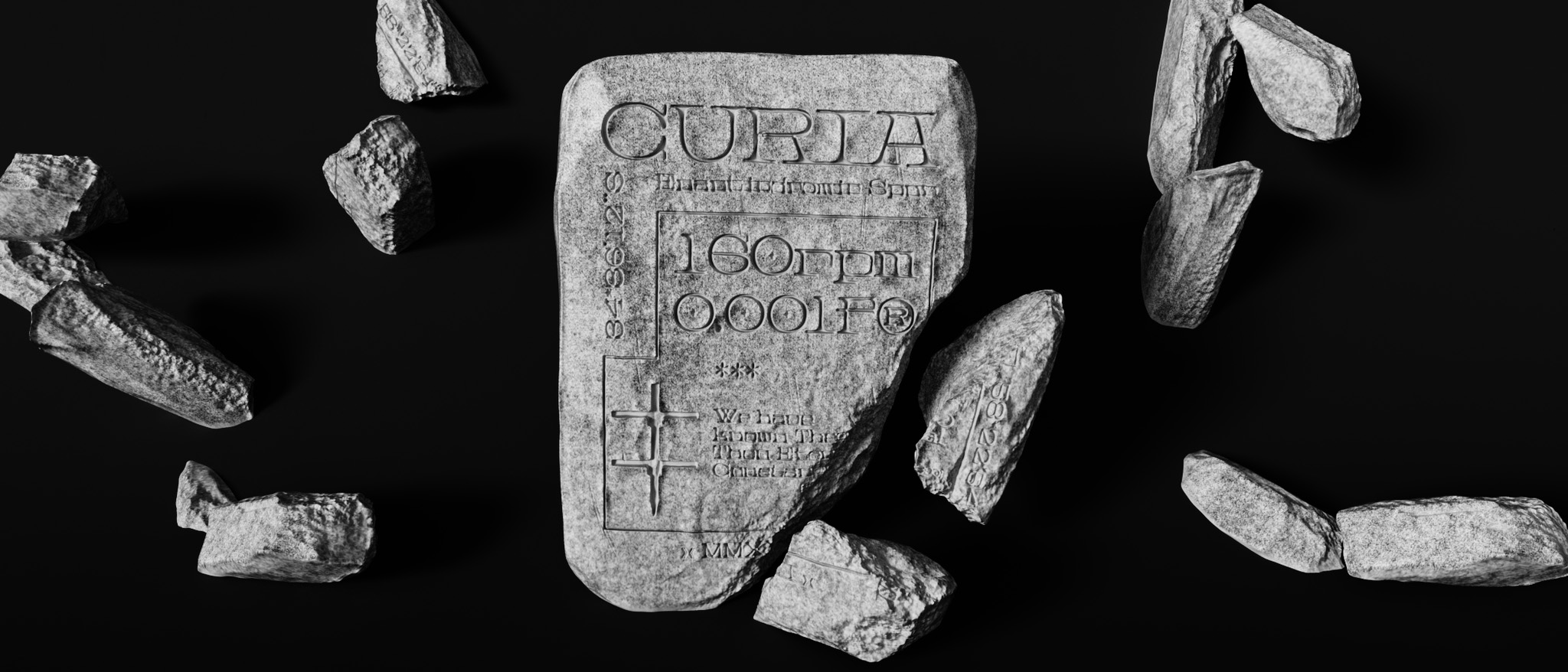
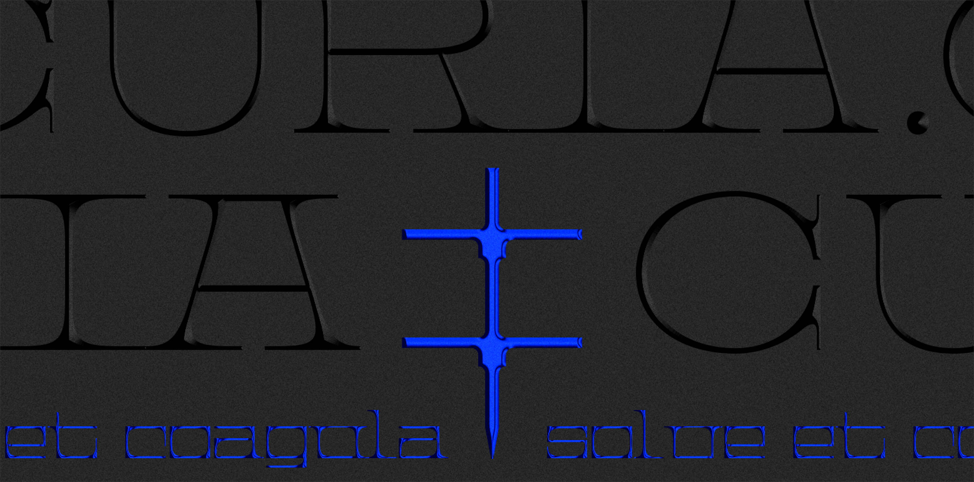
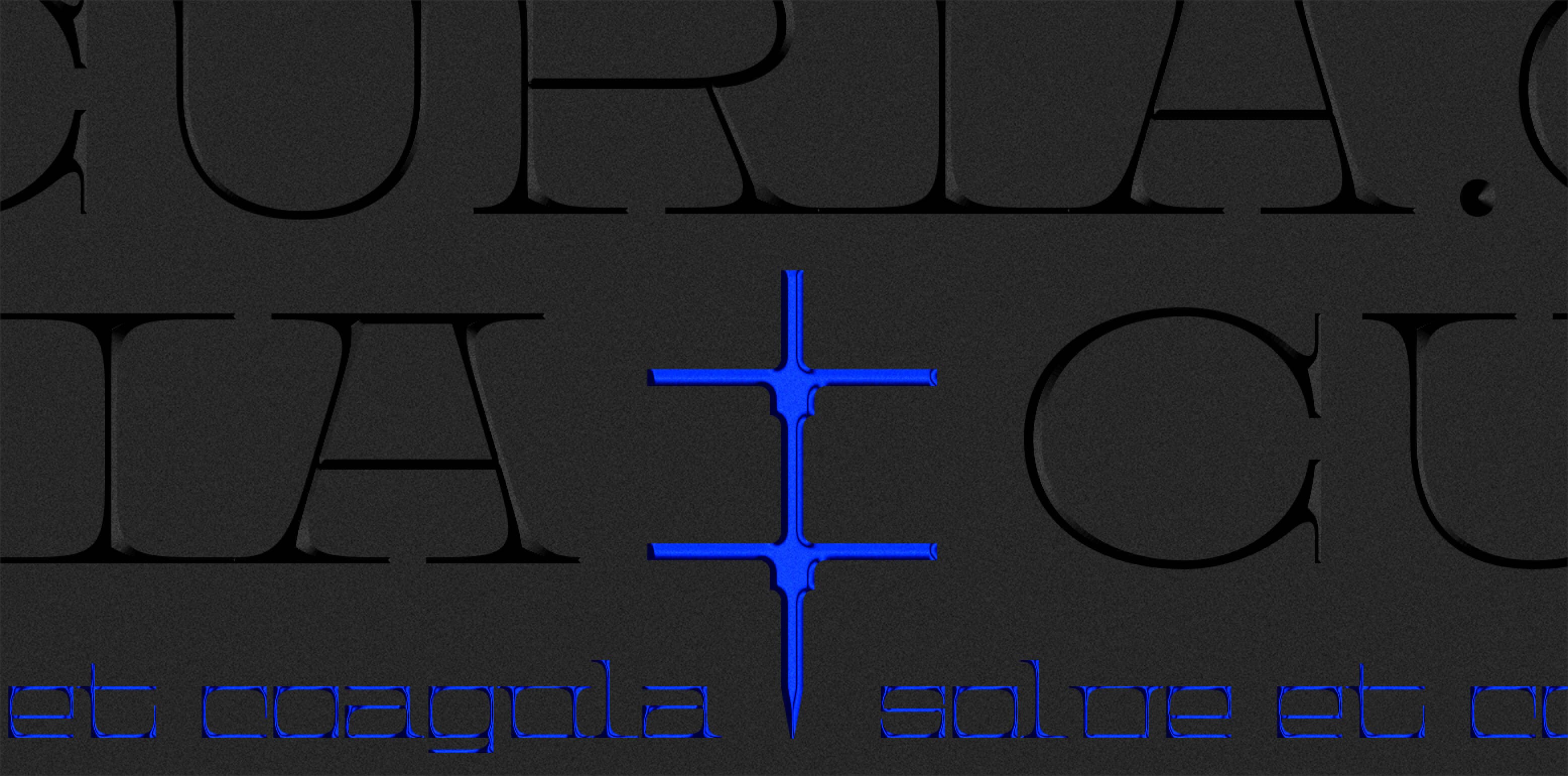
Inspired by a blend of classical Roman capitals & intriguing shapes of Sumerian cuneiform scripts, Curia is the perfect result. The lowercase characters follow a mostly strict mono-spaced design while the uppercase drives traditional letterforms.
« Before the seas, and this terrestrial ball, And Heav'n's high canopy, that covers all, One was the face of Nature; if a face:
Rather a rude and indigested mass:
A lifeless lump, unfashion'd, and unfram'd,
Of jarring seeds; and justly Chaos nam'd. »
You’re asking, ‘What is the point of this introduction? What’s the purpose?’
Today more than ever I understood how impoverished, indeed destitute, our vocabulary is. When we happened to be discussing Plato, a thousand things came up which needed names but lacked them; but there were some which, though they used to have names, had lost them owing to our fussiness. But who would tolerate fussiness in the midst of destitution?
What the Greeks call the ‘gadfly’, which stampedes livestock and drives them all over their pastures, used to be called asilus by Romans. You can trust Vergil on the point:
— There is, near the grove of the Silarus River and the Alburnus green with holm-oaks, A multitude of flies, whose Roman name is asilus but which the Greeks have translated and call ‘gadfly’ —harsh, with a strident sound, by which whole herds of cattle are terrified and driven throughout the forest.¹
It can, I think, be understood that the word had become obsolete.
Not to keep you unduly; certain non-compound verbs used to be current; e.g., they used to say ‘settle it (cernere) by the sword’. Vergil will prove this for you too: Powerful men, born in various parts of the world, Clashed and settled it by the sword.
I shared yesterday with my poor health. It claimed the morning for itself and yielded to me in the afternoon. So I first tested my mind by reading; then, when it tolerated this activity I made bold to ask more of it—rather, to allow it more. I wrote a bit, more vigorously than usual, in fact, since I was grappling with tough material and didn’t want to be beaten. I wrote until some friends interrupted me to bar me forcibly from working, as though I were an obstreperous patient.

Curia
A
uppercase
ABCDEFGHIJKLMNOPQRSTUVWXYZ
lowercase
abcdefghijklmnopqrstuvwxyz
uppercase accents & diacritics
ÁÂÄÀÅÃÆÇÐÉÊËÈIJÍÎÏÌÑÓÔÖÒØÕŒÞẞÚÛÜÙẂŴẄẀÝŶŸỲ
lowercase accents & diacritics
áâäàåãæçðéêëèijíîïìñóôöòøõœþßúûüùẃŵẅẁýŷÿỳ
monospaced characters – ss01
ẂŴẄẀẞ
Squared out characters – ss02
BCDGJOPQRSUÇÓÔÖÒØÕÚÛÜÙ
stylistic set 03
HN
stylistic set 04
EÉÊËÈ
Standard & Discretionary ligatures
COIJDELALLNNTIWWW
numerals
0123456789
PUNCTUATION & SYMBOLS
.,:;!¡?¿*#//-–—()‚„“”‘’«»‹›"'@&¶©®™†‡
currency & math
$€+−×÷=
DesignerAndres Briganti
Publisherbasement.studio
Release dateNovember 2022
Last version1.501
Formatsotf, woff, woff2, ttf
Glyphs244
DescriptionInspired by a mix of classical Roman capitals and the intriguing shapes of Summerian cuneiform script, Curia is the result of an exploration of modularity and serif fonts. The lowercase characters follow a mostly strict mono-spaced design while the drawing of the uppercase characters follows more traditional letterforms, and thus a more proportional style; each case can be seen as its own system.
SpecimenDownload Specimen